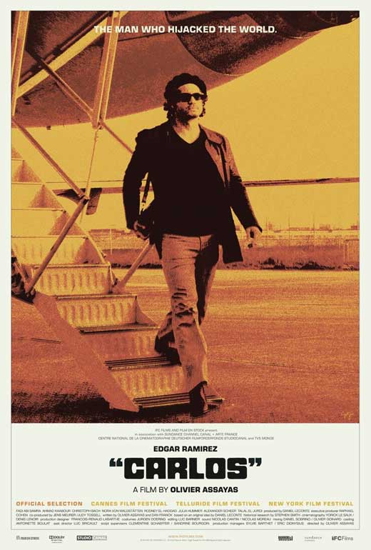
Most bad-ass looking film poster:
 Damn that looks badass. The best types of film posters, in my opinion, are ones that say almost everything about the film without actually saying anything. This poster here is exactly what I'm talking about. I haven't talked about Carlos at all on kenoncinema and, as you may expect, I haven't seen it yet. I'm a fan of Olivier Assayas. As you may remember, "Summer Hours" was listed as one of my favorite films of the 2000s. From what I hear, Carlos is on an entirely different planet. A 5 hour mini-series epic is what it is. Most critics say it's definitely worth the watch and it's been on the top of many top 10 lists already. Can't wait for this to come out on Criterion in 2011.
Most improved movie poster:
The King's Speech marketing campaign started off with this clunker of a poster.
 Too airbrushed, too lame, too boring.
But then, last month, they came out with this:
 Ah, that's more like it. Beautiful.
Classiest film poster of 2010:
It's a tie... between ALL of these Black Swan posters.


 Those aren't posters, they're works of art!
Most mind-blowing film poster of 2010:
 Oh my God that's brilliant.
Most disturbing poster of 2010:

Who thought this poster would be a good idea? What the hell?
Best International Poster of an American film:
 Woody Allen's You Will Meet a Tall Dark Stranger
Raddest looking poster of 2010

I didn't know how else to describe this poster other than the fact that it looks pretty rad.
Sexiest poster of 2010:
 Still can't wait to see this film.
Most constipated poster of 2010:
Ryan Gosling goes from looking sexy with Michelle Williams to looking constipated with Kirsten Dunst. "Damn I really have to go pee... won't she get off me?"
Least Favorite Poster for a Movie that's coming out in 2011:
 Sigh. Covering this film is gonna be interesting. I don't even know what to say about The Beaver at this point. There's just something about Mel Gibson holding a beaver in his hand that I can't take seriously and yet this is supposed to be a serious, heart-warming film about redemption. Yeah... I don't know about this.
And finally, my favorite poster of 2010:
 This poster for "The American" just has this really slick, cool, '70s style, European look to it that I really think is cool. In a year full of some pretty nice looking posters, this one is my favorite... and I haven't even seen the film yet.
Worst poster of 2010:
 When you consider what "The Switch" is supposed to be about, the look on Jason Bateman's face and just the whole situation behind that picture does not scream "poster" material to me and it also exemplifies the worst type of film poster. It too literally expresses what the film is supposed to be about, especially if the film is about switching sperm samples.
Happy New Year.
No comments:
Post a Comment